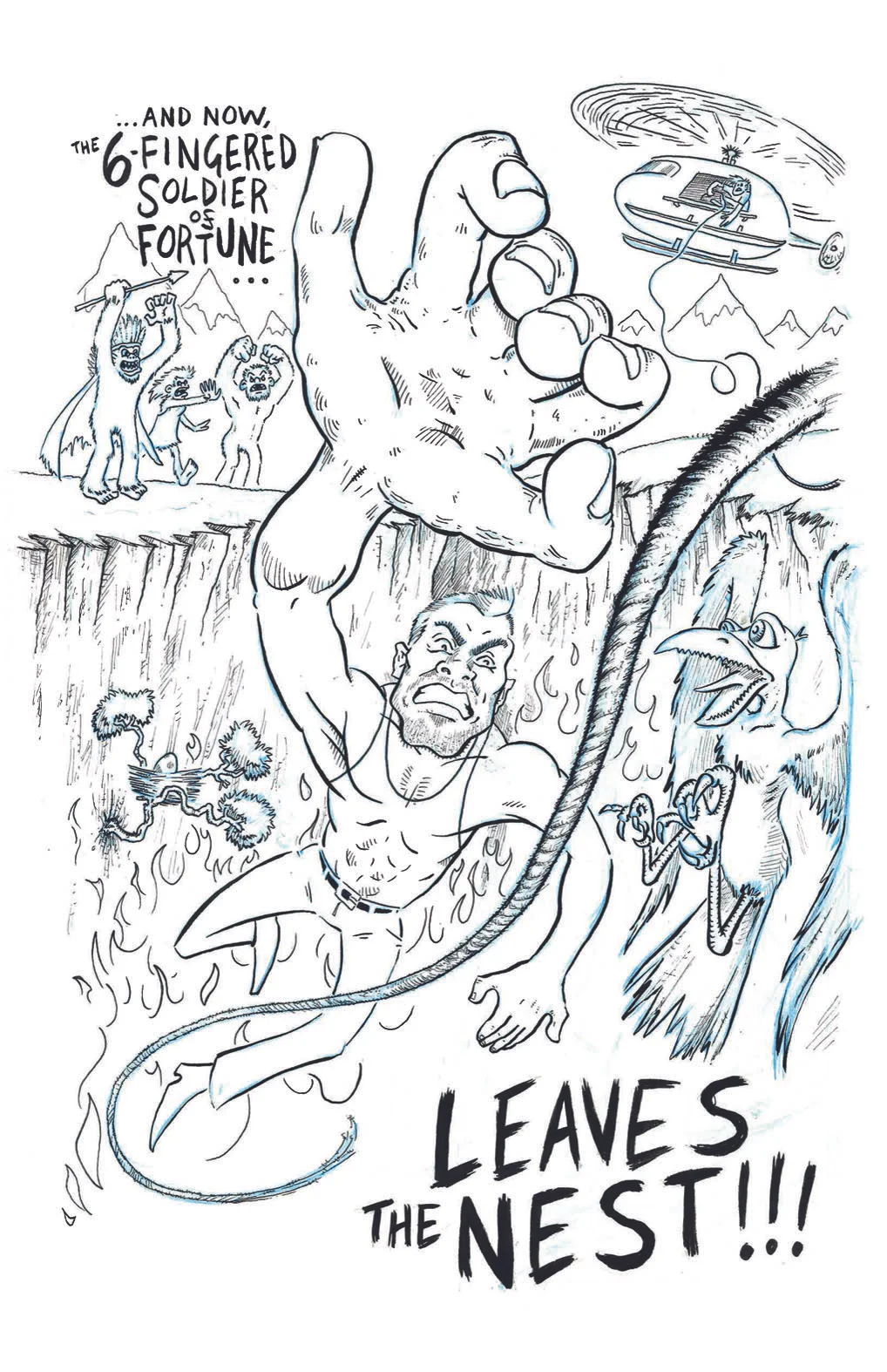
The 6-Fingered Soldier Of Fortune Leaves The Nest
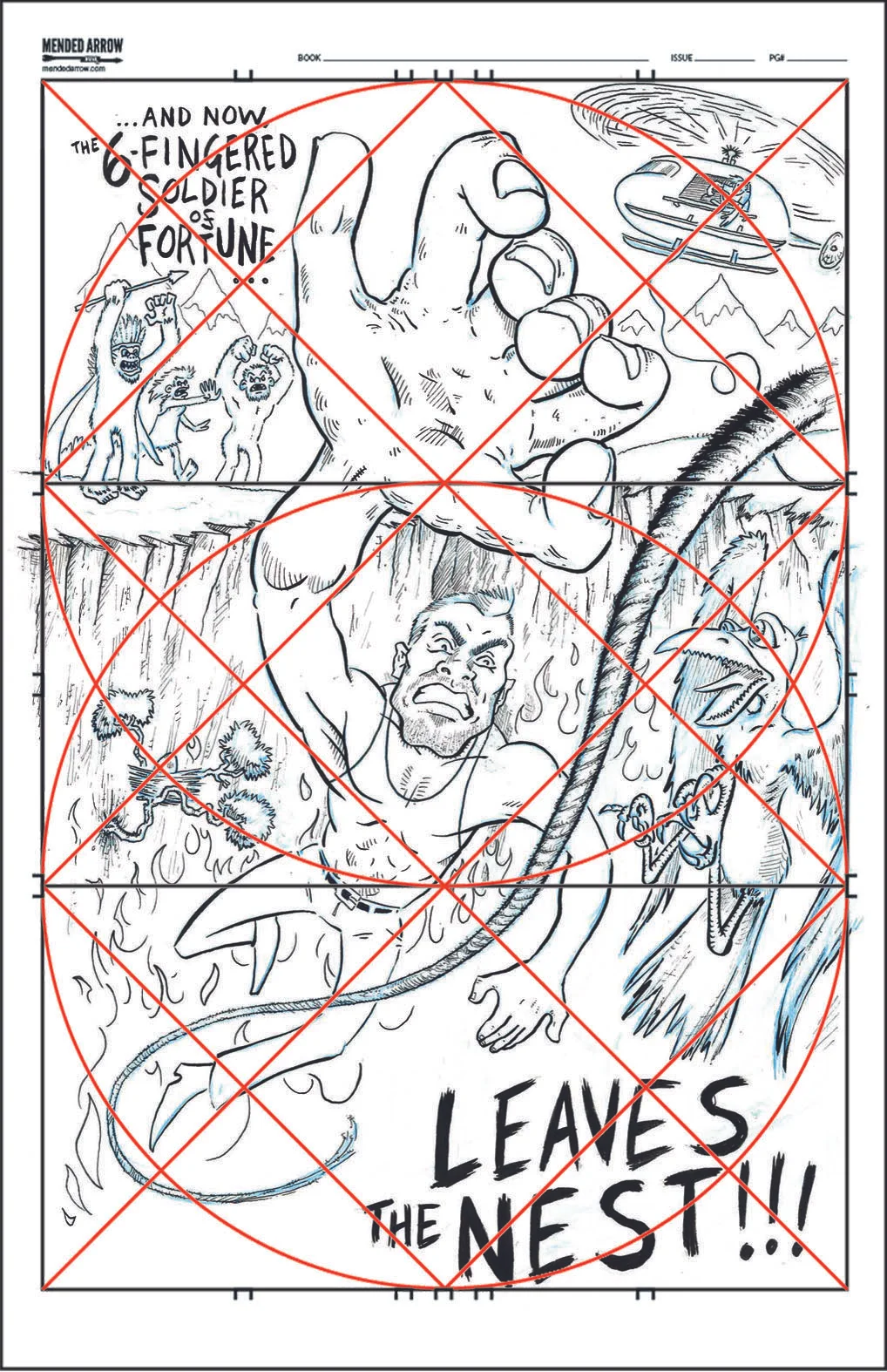
/MakingComics.com is a great resource for illustrators at all levels, and one of my favorite websites. I recently stumbled into this great blog about using the Golden Ratio to form the composition of your illustrated pieces, and that's just what I did with this fella.
The blog even offers an easily downloaded template for the grid, so I just printed that and used my trusty lightbox to compose the image over it. I tried to line up the eye line and the action lines with the grid. I knew that I wanted to put this big, six-fingered hand in the foreground and then cram as much story and action into the piece as possible. I'm pretty happy with how it's turned out so far.
Currently hanging on my wall, waiting for some color, a story, and a name for this main character. I'm open to suggestions... hit me up on Twitter or in the comments section and let's tell a story.
Check it out with the grid overlaid:


